The Art of Plating: Making Food Look Beautiful
If you want a dish to feel intentional before the first bite, plating is where the decision becomes visible. I do not treat plating as decoration. I treat it as the final edit: the moment when flavor, timing, and restraint either look organized or look rushed. That is why a plate can make a simple meal feel polished, and why a beautiful plate can still fail if the food underneath is careless.
When people search for plating advice, they usually want the same few answers: How much empty space is too much? Which plate shape helps the food? Where should the sauce go? And how do you make a dish look composed without turning it into a museum exhibit with garnish? There is a real reason these questions matter. Le Cordon Bleu’s note on whether beautiful food tastes better points to a well-known effect in dining: presentation changes perception. Escoffier’s overview of food presentation makes the same case from a practical culinary angle. The visual part is not separate from the meal; it is part of the meal.
This guide is built to be useful at home, in a small restaurant, or in any kitchen where the goal is not just to feed people but to serve food with a sense of order. You will learn the core ideas behind plating, the techniques that make food look professional, the creative choices that keep a plate interesting, and the mistakes that undo a good dish in the final thirty seconds.
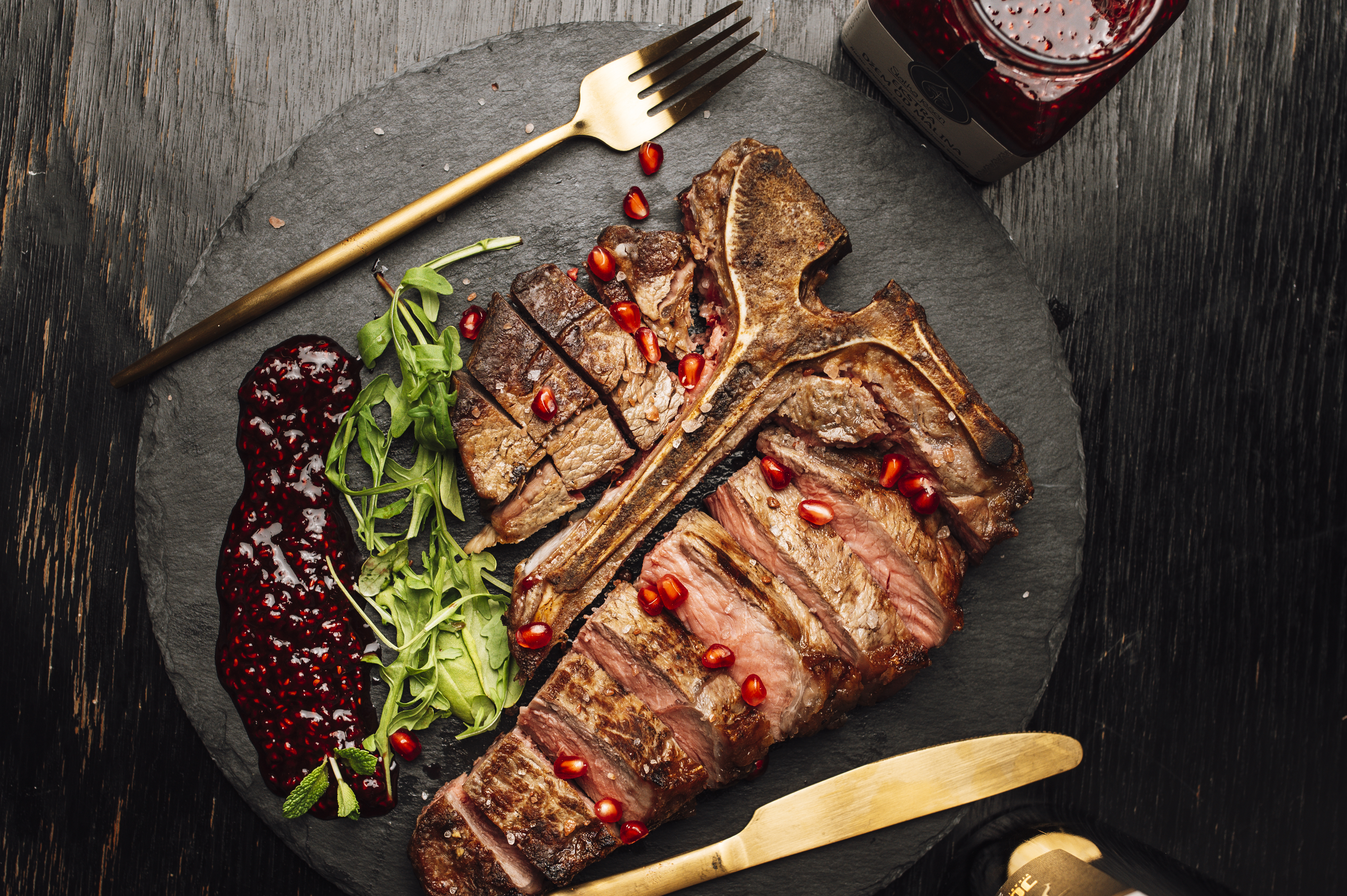
Basic terms that matter
Plating has its own vocabulary, but the best definitions are simple. You do not need a culinary degree to understand them. You need a clean plate, a clear plan, and enough discipline to stop before the dish becomes crowded.
- Composition is how the components are arranged. Good composition tells the eye where to look first and where to move next.
- Negative space is the empty area on the plate. It gives the food room to breathe and keeps the presentation from feeling heavy.
- Focal point is the main visual anchor. It may be the protein, the vegetable stack, the sauce line, or the tallest element on the plate.
- Height adds dimension. A flat plate can still work, but a little vertical structure usually makes a dish feel more intentional.
- Contrast comes from color, texture, and shape. Creamy beside crisp, pale beside dark, smooth beside rough: the eye likes differences when they are controlled.
- Garnish should support the dish. If it is there only because a kitchen wanted more green on the plate, it is not garnish. It is clutter.
- Sauce control refers to how the sauce is placed, spooned, dotted, brushed, or pooled. Sloppy sauce is one of the fastest ways to downgrade a plate.
- Finish is the final check: clean rim, correct temperature, balanced layout, and no accidental fingerprints. The details are rarely glamorous. They are, however, the part people remember.
Those terms sound simple because the work is simple in theory and strict in execution. The plate is a small space. That constraint is the entire game.
Basic plating techniques
When I look at a plate, I usually ask three questions: what is the hero, what is the supporting cast, and what is the one detail that keeps the composition from feeling static? The answers shape the final result more than any fashionable garnish ever will.
1. Choose the right plate before you start
Plate choice is not a neutral decision. A large white plate creates room for clean negative space, while a dark plate can make bright ingredients stand out with more drama. A shallow bowl can frame sauced dishes better than a flat plate. A busy plate pattern can distract from delicate food, which is how the meal ends up competing with its own surface. That is rarely a strong business case for design.
In practical terms, the plate should match the portion. If the food is a small, delicate tasting plate, do not trap it on a dinner plate that looks like an empty parking lot. If the dish is rustic and hearty, a tiny plate can make it feel cramped. The right container does half the work before the food arrives.
2. Build around a focal point
Every good plate needs one thing that the eye finds first. That focal point can be a piece of seared fish, a neat bundle of vegetables, a quenelle of puree, or a sliced protein arranged at a deliberate angle. Once the focal point is in place, everything else should support it rather than fight it.
A useful habit is to place the main element first, then add the secondary elements in layers. This prevents the common problem where a plate is built from the edges inward and the center ends up looking accidental. Professional plating is often just disciplined decision-making with better lighting.
3. Use height without building a tower
Height makes food look alive, but too much height makes food look unstable. The point is not to stack ingredients into a sculpture that threatens to collapse before the server reaches the table. The point is to create enough lift that the plate has dimension.
Good ways to add height include leaning sliced vegetables against the main protein, stacking crisp elements under something softer, or finishing with a light herb garnish that gives the top of the plate a defined end point. Height should feel natural, not engineered like a small bridge project.
4. Balance color and texture
Color is one of the fastest ways to make food look appealing, but it works best when it is controlled. A plate with only beige and brown can feel flat, while a plate with too many bright colors can start to look chaotic. The trick is to make one or two colors dominate and let the rest provide contrast.
Texture matters just as much. If everything on the plate is soft, the dish may taste fine but look one-dimensional. Add crunch, silkiness, chew, or gloss where the dish needs it. This is one reason the best plated dishes often mix seared, pureed, crisp, and fresh elements. Fine dining lovers love to talk about this because it works.
| Technique | What it does | When to use it |
|---|---|---|
| Negative space | Makes the plate look clean and deliberate | When the dish has a strong central component |
| Height | Adds visual energy and dimension | When the food can hold its shape |
| Sauce placement | Frames the dish and adds movement | When the sauce is part of the presentation, not only the flavor |
| Contrast | Helps the eye separate elements quickly | When the dish needs more definition or emphasis |
5. Control the sauce, do not let it control you
Sauce is where many plates are won or lost. A precise dot, a clean swipe, or a small pool can make the composition feel intentional. A splashed, overpoured sauce can make the plate look hurried and expensive in the wrong way.
There is no single correct sauce style. A rustic stew wants a different treatment from a delicate seafood starter. What matters is consistency. If the sauce is the bridge between components, it should look like a bridge, not a spill.
For practical examples of saucing and tool use, Fine Dining Lovers’ plating tools guide is a helpful companion. The tools are not magic. They simply make precision easier to repeat.
6. Keep the rim clean and the portion honest
This sounds obvious because it is obvious, which is exactly why it gets ignored. A clean rim makes the food look cared for. An oversized portion can crush the composition. An undersized portion can make the plate look timid. The visual balance and the eating balance should agree with each other.
I would rather see a modest portion with discipline than a crowded plate with no clear shape. The goal is not to prove abundance at every meal. The goal is to present the food so that every ingredient earns its place.
7. Work with timing, temperature, and service flow
Plating is not isolated from the rest of the kitchen. If the food sits too long after it is plated, greens wilt, crispy items soften, and sauces thicken in awkward ways. The best-looking plate can still fail if it is held too long before service.
This is where mise en place matters more than people want to admit. If the garnish is ready, the sauce is ready, and the plate is warm or cold as needed, the final assembly becomes a calm sequence instead of a scramble. For a concise explanation of that discipline, Le Cordon Bleu’s discussion of mise en place is worth a read.
Creative plating ideas
Once the basics are in place, creativity becomes useful instead of decorative. The best creative plates do not add complexity for its own sake. They create a stronger story about the dish. The story might be seasonal, regional, rustic, elegant, or minimal. The only mistake is pretending that style is the same thing as care.
1. Use asymmetry to make the plate feel alive
Perfect symmetry can look formal, but it can also feel stiff. Asymmetry creates motion. A protein slightly off-center, a puree placed to one side, or a garnish that leads the eye across the plate can make a dish feel more natural. The eye likes a path. Give it one.
A simple rule helps: let one side of the plate carry a little more visual weight, then balance it with a lighter element on the other side. The dish does not need to be mathematically equal. It needs to feel stable.
2. Tell a seasonal story
Seasonality is one of the easiest ways to make plating feel current. Spring plates can look lighter, with bright greens and soft whites. Summer plates can use vivid color and juicy fruit. Autumn plates can lean into warmth, roasted tones, and earthier textures. Winter plates often benefit from contrast and deeper color.
You do not need a theme night to do this well. A single herb, a seasonal vegetable, or a sauce colored by what is in season can provide the visual cue. The point is to make the plate look like it belongs to the ingredients, not to a random trend cycle.
3. Treat the plate like a landscape, not a pile
One of the easiest creative mistakes is to think in terms of “putting food on a plate” instead of “arranging a scene.” A plate can have a horizon line, a path, a focal peak, and a quiet background. That does not mean it should look theatrical. It means the arrangement should be intentional.
Consider one dominant shape and one or two supporting shapes. Curves can soften a dish. Straight lines can make it feel modern. Small repeated elements can create rhythm. This is the difference between a meal and a composition.
4. Make dessert playful, but not careless
Dessert plating allows more freedom, but it still benefits from structure. A bright sauce, a crisp shard, a scoop of something cold, and a carefully placed garnish can turn a simple dessert into a more memorable finish. The trick is not to overdo the sugar logic.
Many dessert plates fail because they try to include too many patterns, drips, and textures at once. Let one element be the hero. Let the others make it clearer. If you want broader inspiration on presentation style, Fine Dining Lovers’ dinner-party plating piece gives a useful sense of how the final arrangement should support the occasion.
5. Design for the diner, not just the camera
Food photos travel. Plates get photographed. That is reality. But a dish should still work as a dish first. A garnish that only looks good from one angle and falls apart when cut is a weak design choice. A sauce line that blocks access to the food is not elegant; it is inconvenient.
One practical test: imagine the first bite. If the guest has to destroy the composition to eat the dish, the plate may be too precious for its own good. Good plating looks considered, but it still respects the fact that the food must be eaten.
6. Keep a record of what works
Consistency is where creativity turns into a system. If a dish comes out especially well, save a photo, note the plate size, and record the garnish order. This is especially useful in a team kitchen, where memory is not a reliable operating plan.
If a kitchen wants a simple way to track plating standards, a web app generator can be a practical shortcut for building a lightweight checklist or photo log. The point is not technology for its own sake. The point is repeatability, because the second good plate matters more than the first one.
7. Borrow ideas, then make them yours
There is nothing wrong with studying professional plating. In fact, it would be foolish not to. The mistake is copying a plate so closely that it stops matching your kitchen, your ingredients, or your service style. Borrow the principle, not the costume.
That is why good references are valuable. Fine Dining Lovers’ guide to plating like a pro is helpful because it breaks down the structure behind polished presentation rather than treating it like a secret ritual. Once you understand the structure, your own version becomes easier to design.
Common mistakes to avoid
The fastest way to improve plating is often not to add something new. It is to remove the habits that make the plate look less finished. Most errors are not subtle. They are the visual equivalent of a meeting that should have been an email.
| Mistake | Why it hurts the dish | Better move |
|---|---|---|
| Overcrowding the plate | Makes the dish look noisy and hard to read | Leave more space and let one element lead |
| Using random garnish | Creates confusion and weakens flavor logic | Choose garnishes that support the ingredients |
| Ignoring plate size | Can make the food look lost or cramped | Match the plate to the portion and the style of the dish |
| Dirty rims or spills | Makes the plate feel rushed and unpolished | Wipe the rim before service |
| Too many colors and shapes | Distracts the eye and blurs the focal point | Limit the palette and choose one clear composition |
| Letting food sit too long | Damages texture and temperature | Plate close to service and keep the workflow tight |
Another common mistake is designing a plate around the garnish instead of the dish. A garnish should never force the main ingredients into a worse shape just so the final touch looks impressive. The garnish works for the food, not the other way around.
It also helps to remember that a lot of professional plating is about repetition. One good dish can be a lucky break. Five plates in a row that look equally clean are a system. If the kitchen cannot repeat the result, it does not really have a plating standard yet.
How to practice without wasting ingredients
- Use one plate and two ingredients, then move them around until the composition feels balanced.
- Practice sauce placement on a cold plate before using the real dish.
- Take a photo from the diner’s point of view, not from overhead only.
- Ask whether every item on the plate has a flavor role, a texture role, or a visual role.
- Repeat the same dish three times and compare the results. Improvement usually shows up in the second and third attempt, not the first.
If you want more food ideas after this, the site’s blog index keeps the latest articles together, the home page returns you to the main site, and the contact page is the direct route if you want to ask about a topic or suggest the next guide.
Conclusion and practice
Good plating is not about luxury. It is about order. It tells the diner that someone thought ahead, chose carefully, and finished the job properly. That is a strong signal in any kitchen. It works at home, in a café, in a restaurant, and anywhere else food is supposed to feel cared for.
The simplest version of the rule is this: choose a plate that fits the food, give the eye a focal point, use contrast and height with restraint, keep the rim clean, and plate close to service. That sounds almost too practical, which is exactly why it works. Presentation rarely rewards drama for its own sake. It rewards control.
So start with one dish. Fix one problem at a time. Study a good reference, then make your version cleaner, calmer, and more repeatable. The first plate is practice. The second is where the standard begins to appear. The third is where you stop calling it luck.
- Plating is a decision, not a garnish lottery.
- Space, balance, and contrast matter more than excess.
- Good plates look intentional because they are deliberate.
- Practice turns presentation into a repeatable skill.